Launch brief / Product notesTo review
Illustrative draft · Tap the wording to edit
 /Apps
UI & BRAND GUIDE FOR AGENTS
This is the UI and brand guide for agents building Sauna-native apps. Read the Markdown for design rules, assets, and interaction patterns.
The review desk shows the guide in use: sample jobs you can review, edit, and approve on mobile and web.
Illustrative draft · Tap the wording to edit
A list, the context, and the next action. Read and edit in the same place. This is one possible composition; interactions stay in this page.
A neutral starting point.
Use color when it has something to say.
White is still the canvas. Give colour a specific job; leave the rest quiet.
Square edges. Fine rules. A 4 px rhythm.
0 px radius / 160 ms transitionsFamiliar behaviours. A little character.
Try the controls and their states.
One clear next step. Ink is the default; Forest can give a meaningful completion action a little warmth.
44 px minimum · 0 px radiusA local interaction specimen. Nothing is saved or sent.
Keep the label visible. Put feedback beside the field and explain how to fix it. Checkboxes express explicit choices.
Labels above · Feedback belowA status needs words as well as colour. Give empty, loading, and error states the same care as a finished result.
Keyboard tabs · Named statesThe next step belongs to the person.
A recorded decision, tied to a revision.
Keep the written direction with the draft.
Group related things closely. Leave more space between different ideas. A fine rule is often all the structure you need.
4 px base · No shadows481216243248648–12 px within a control · 24 px within a section · 48–64 px between ideas
Use native buttons, labelled inputs, and real disabled states. Keep focus visible with a 2 px Ink outline and 3 px offset. For tabs, use a labelled tablist, one active tab stop, and linked tab panels. Arrow keys move focus; Enter or Space selects.
Keep the actual loading or error state connected to the operation it describes. Use the controls above as specimens, not as a substitute for persistence or delivery.
@import url("/brand/apps/tokens.css");

.review-action {
  min-height: 44px;
  padding: 10px 16px;
  border: 1px solid var(--sauna-studio-forest);
  border-radius: var(--sauna-studio-radius-control);
  background: var(--sauna-studio-forest);
  color: var(--sauna-studio-panel);
}
.review-action:focus-visible {
  outline: 2px solid var(--sauna-studio-ink);
  outline-offset: 3px;
}
.status--review { color: var(--sauna-studio-tangerine-deep); }
.status--approved { color: var(--sauna-studio-forest); }Choose the shape the work needs.
These are possibilities, not a prescribed shell.
Read a draft, adjust the wording, and approve a revision.
Check the person, the reason, and the actual message together.
Choose a shortlist with useful context and verified profiles.
Put the proposed event beside the agenda and preparation.
Compare the evidence, criteria, and cost before choosing.
Keep findings connected to sources and open questions.
Edit the actual page and the message that accompanies it.
Review the email and why it matters together. Swipe or use the arrows to move; Include and Skip stay explicit. Approve the batch after every person has a decision.
Try the email reviewThese examples use illustrative records in browser storage. Approval records a local decision; it does not send, book, buy, or publish.
A small painted moment can make a tool feel
more personal. Give it a place, then stop.
Getting things ready…
Forest, steel, a little clay. Simple marks over the faintest wash of colour.
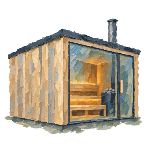
Let the work choose. A small sauna for an honest pause; a simple mark for orientation. Neither belongs on every page. Keep the reading surface clear.
Download paintingRead guide.md before building. It covers the UI and brand rules, exact asset URLs, and links to the interaction details. Choose the layout that fits the work.
.mdDesign tokensColor, typography, spacing, and behavior.cssStructured referenceThe same foundations, ready for your tools.jsonJob examplesSeven illustrative records with the real artifact shapes.jsonJobs & interactionsRecord contracts, batch review, exports, and navigation.mdSauna assetsOriginal marks and brand referenceAssets